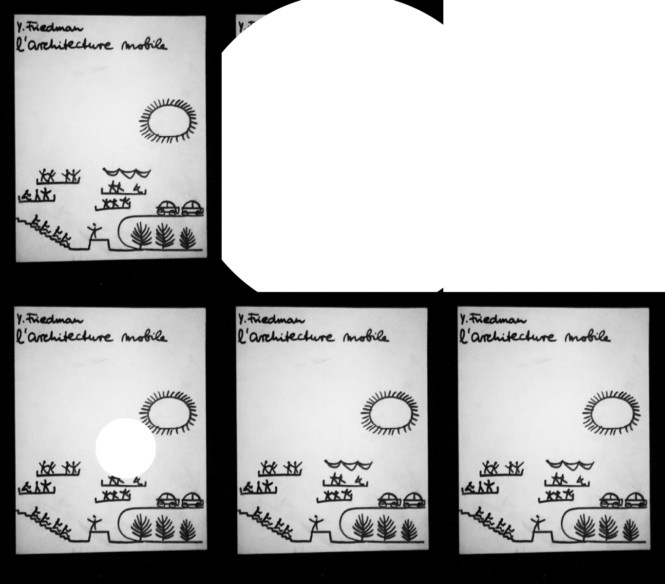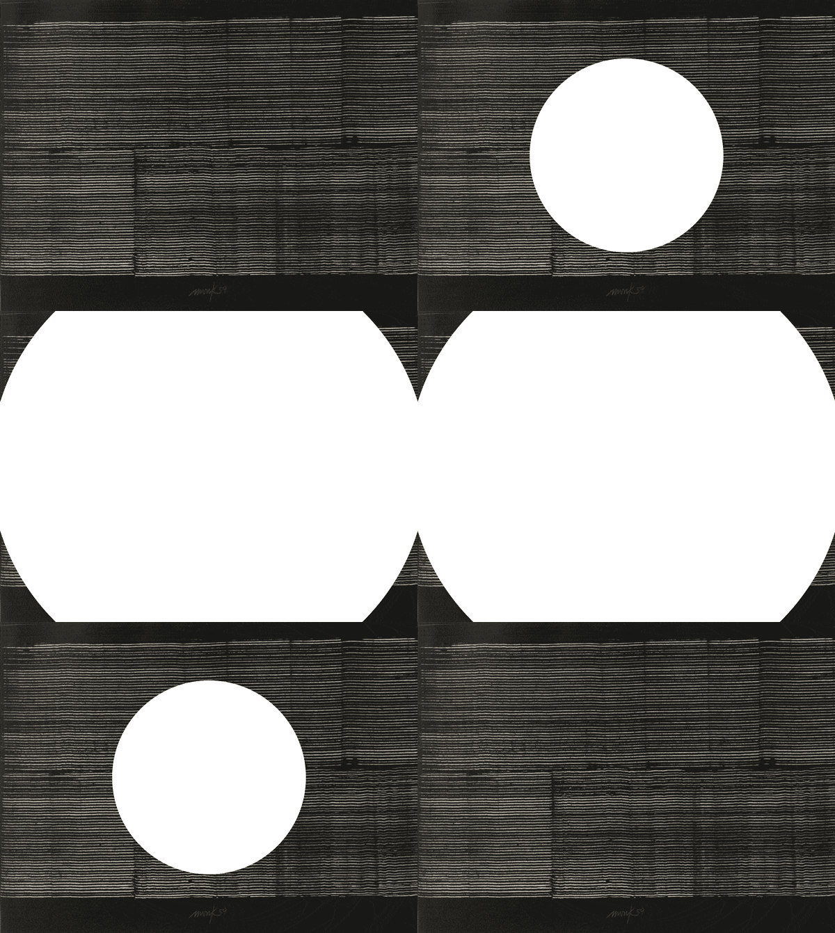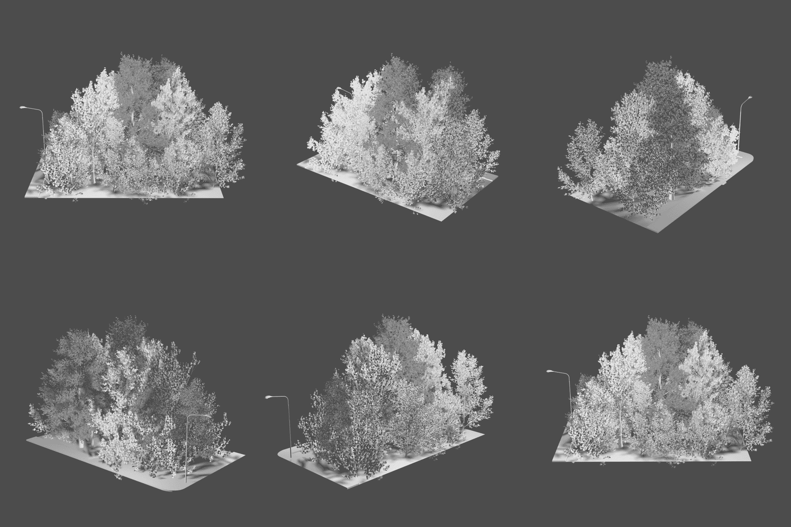

Echoing the Groundworks timeline and the Visual Natures mapping: 1962
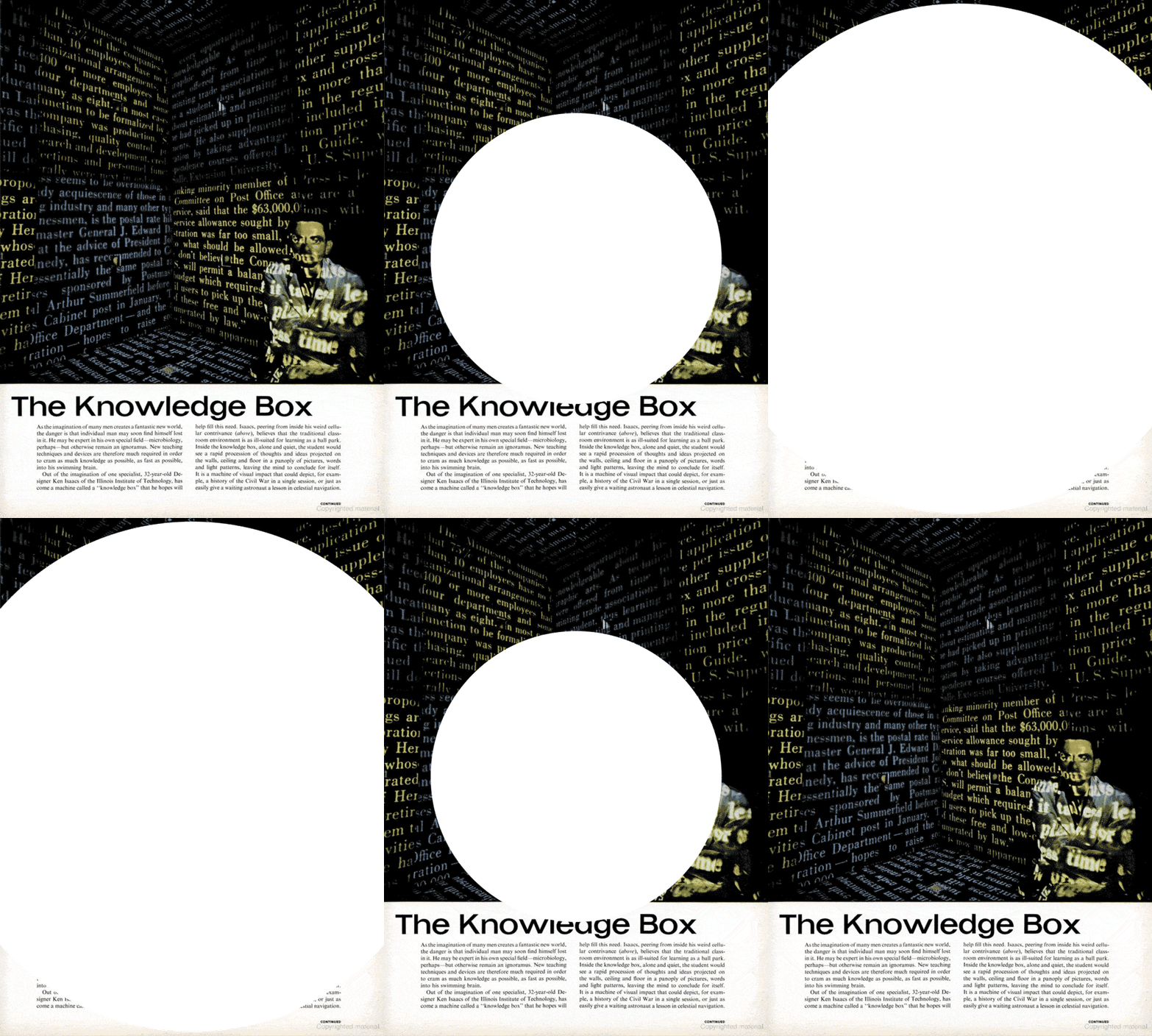
An interview with the writer, researcher and art critic Susan Snodgrass, who recently published a book on Ken Isaacs (1927–2016), Inside the Matrix: The Radical Designs of Ken Isaacs (Half Letter Press, 2019), and worked with Isaacs to rebuild his famous Knowledge Box (1962) for the exhibition Learning Modern (2009), speaks about how she first discovered his work, the specificities of the Knowledge Box and the designer’s matrix concept.
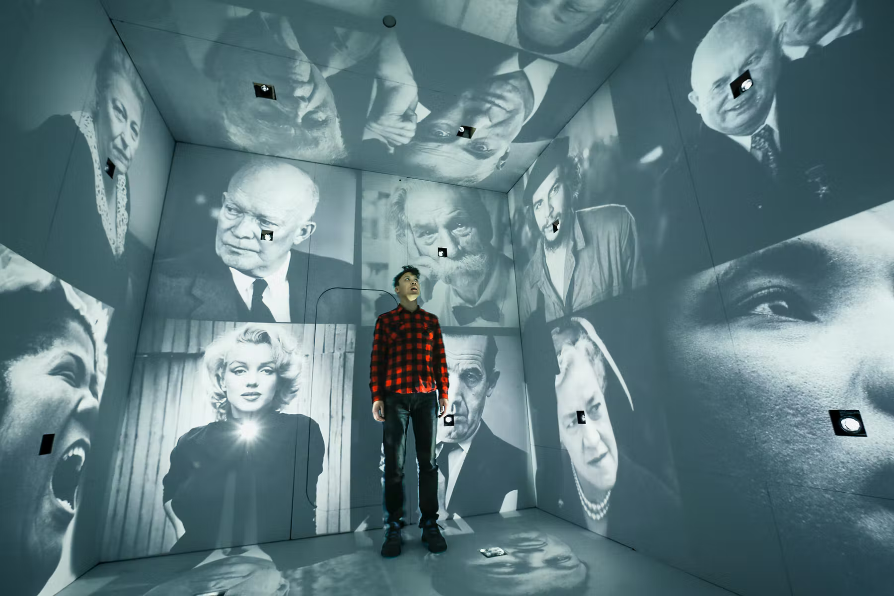
Installation view: Ken Isaacs, Knowledge Room, Hippie Modernism: The Struggle for Utopia, Walker Art Center, Minneapolis, 2015. Photo: Greg Beckel for Walker Art Center. Courtesy: Walker Art Center.
maat / Maria Kruglyak
We got in touch with you in search of information on Ken Isaacs and images of his work, especially the Knowledge Box that is featured in the Visual Natures The Politics and Culture of Environmentalism in the 20th and 21st Centuries mapping, and quickly realised that you have published extensively on his work since 2009 including several interviews and of course also your book, Inside the Matrix. You also led the reconstruction of the Knowledge Box in 2009. How did you first discover Isaacs’ work?
Susan Snodgrass
In 2008–2009, I was asked to do curatorial research for the Learning Modern exhibition at the Sullivan Galleries of the School of the Art Institute of Chicago (SAIC) and discovered documentation about the Knowledge Box in the archives of the Illinois Institute of Technology (IIT) in Chicago, where Ken briefly taught from 1961 to 1962. Given the theme of the exhibition, I thought, “Wow this is an amazing project that I don't know anything about.”
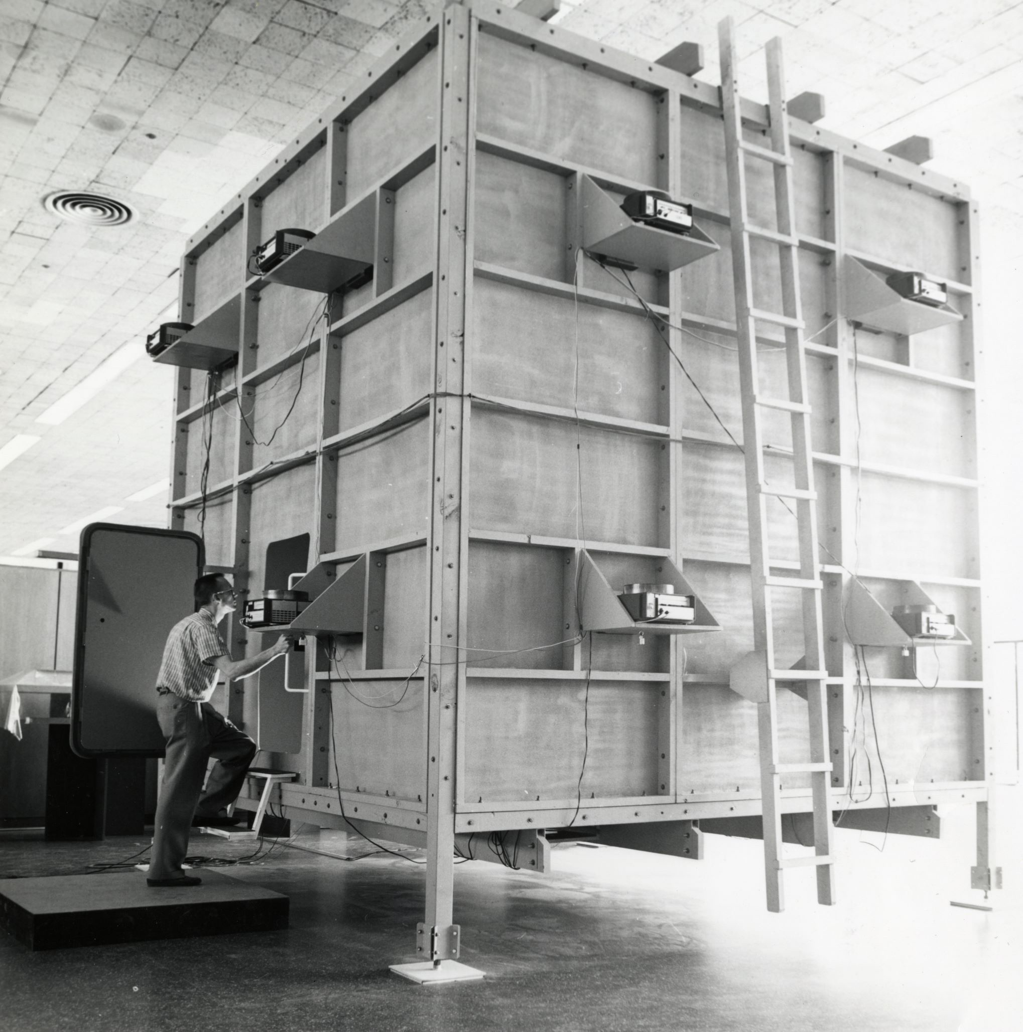
I soon discovered that Isaacs’s designs, including the Knowledge Box, were in fact quite popular and deserved further exploration. I was fortunate to be able to meet Ken and work closely with him to create the 2009 version of the Knowledge Box for the Learning Modern exhibition. Despite the fact that Ken talked about his design work as a search for simplicity (a central theme I discuss in my book Inside the Matrix), the Knowledge Box is actually a very complex structure and was not so easy to reconstruct. We assembled a team of people: key figures from the Sullivan Galleries, who led the installation, as well as the audio and tech production; students from IIT who helped with the fabrication and installation; and students from SAIC who helped with the research and slide production. Since the 1962 Knowledge Box no longer existed, including the original slide and audio programmes, we worked with Getty Images to create the new slide programme for which we needed to obtain permission to use each of the nearly 300 slides. Another key challenge was obtaining the 24 slide projectors needed to project the images, as slide projectors – which had been everywhere in the 1960s – had become obsolete.
Again, I was fortunate to be able to work alongside Ken, who was a very generous spirit and brought that very generosity to his designs. Particularly interesting when working with him on the reconstruction of the Knowledge Box was his openness to other people’s ideas; there was always room for others to bring something of their own into the project. He had a wonderful sense of humour and a way of critiquing something that was playful yet always right to the point.
Then in 2015, I was contacted by the Walker Art Center in Minneapolis, who wanted to include the Knowledge Box in the exhibition Hippie Modernism: The Struggle for Utopia. We didn't need to rebuild the Knowledge Box but had to change parts of the slide programme as some of the images were no longer available. At this point, Ken's health was declining, however curator Andrew Blauvelt was able to meet with him during the initial research phase of the exhibition, so Ken was still a part of the conversation. I was also asked to interview him for the exhibition catalogue.
I had no idea that I would spend 10 years of my life involved in Ken’s work, from when we first started working together in 2009 to when my book was published at the end of 2019, even if I had other research and writing as well during this time. After his death in 2016 and the death of his wife Sara in 2019, I worked with some of his remaining family members to donate his archives to the Cranbrook Archives in the Cranbrook Center for Collections and Research at Cranbrook Art Museum. It is a wonderful way to end a particular chapter of my life and to know that his legacy is being cared for and will continue beyond me.
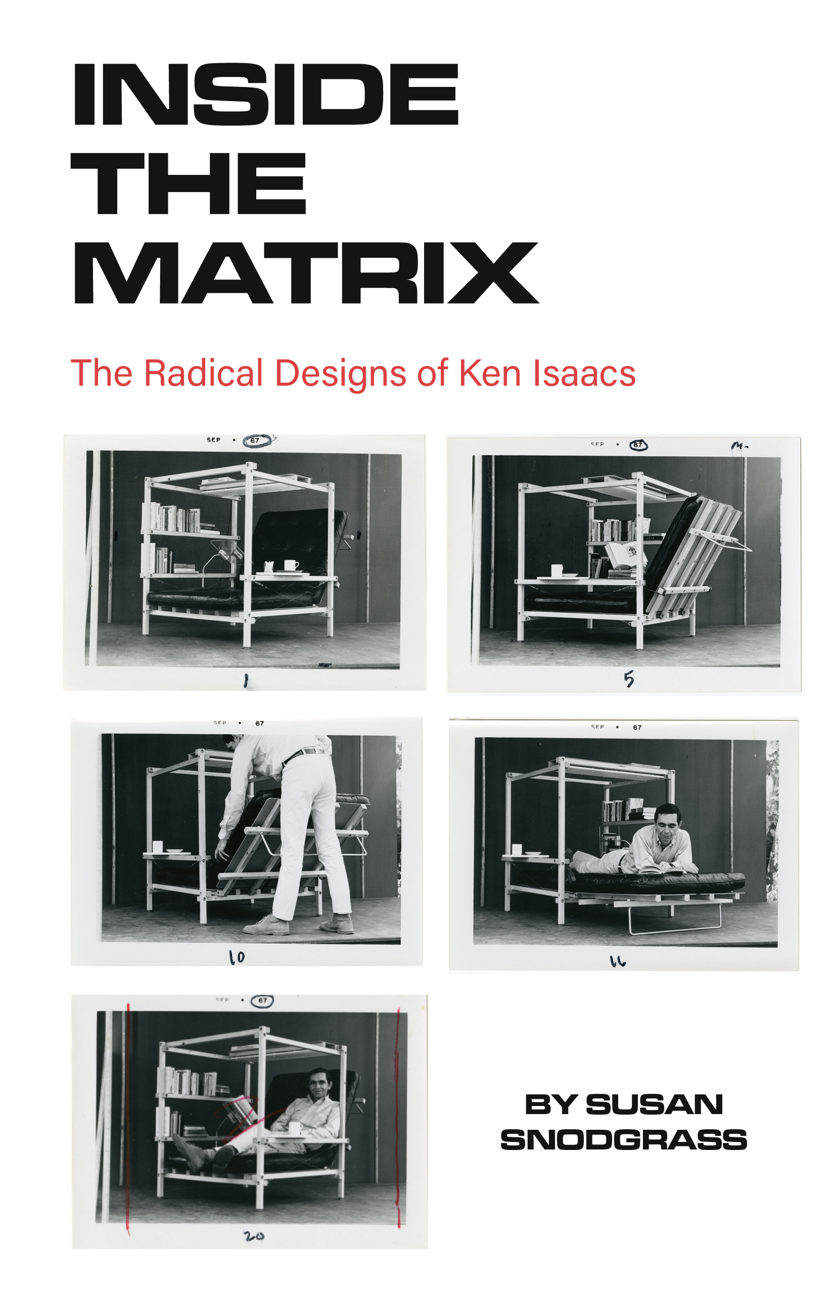
Cover of Susan Snodgrass, Inside the Matrix: The Radical Designs of Ken Isaacs (Half Letter Press, 2019). Courtesy: Susan Snodgrass.
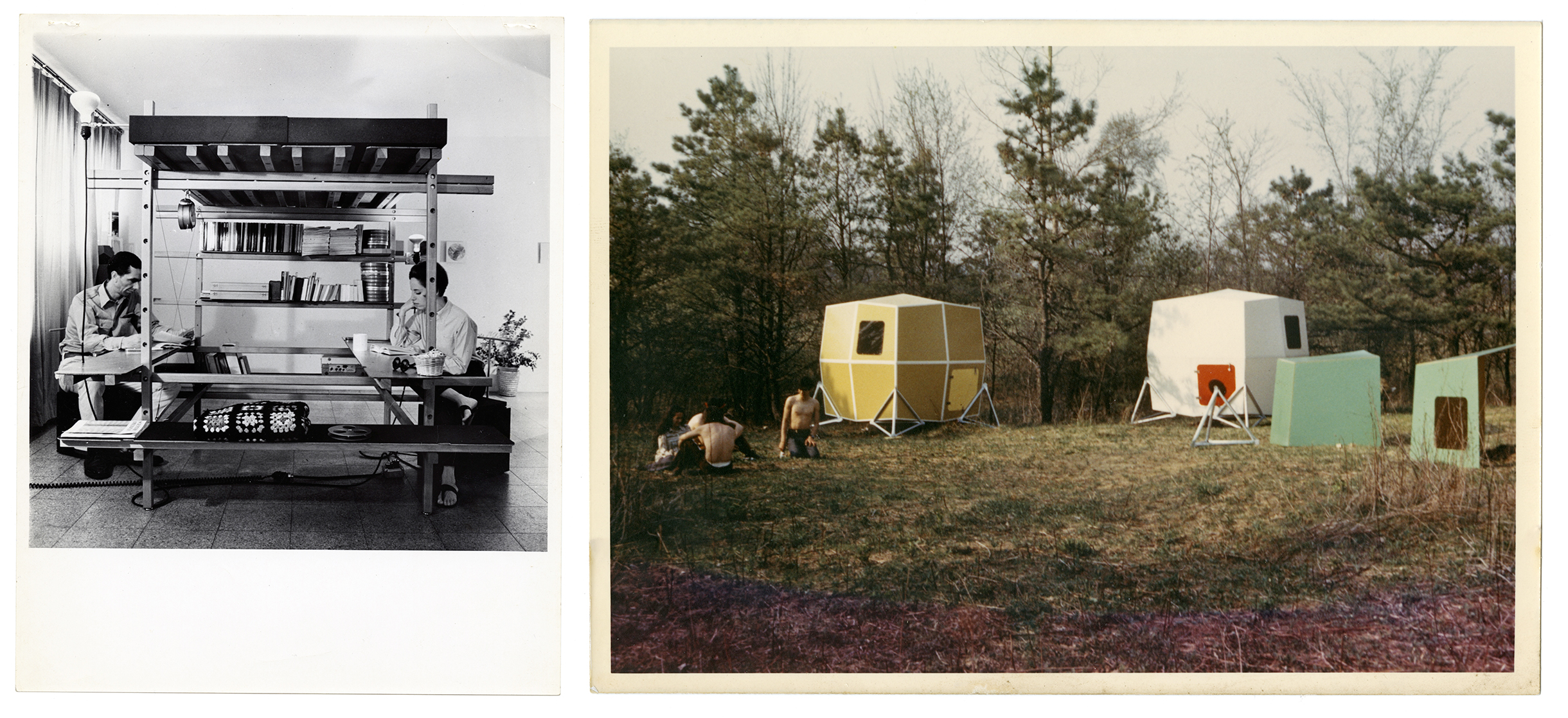
Ken Isaacs, Chicago Living Structure (c. 1961). © Joshua Isaacs. Courtesy: Cranbrook Archives, Cranbrook Center for Collections and Research.
Ken Isaacs, Microhouses (c. 1972). © Joshua Isaacs. Courtesy: Cranbrook Archives, Cranbrook Center for Collections and Research.
“I wanted something that was my own”
Ken Isaacs
maat
Within what field would you place his work, considering that these naturally overlap and intertwine?
Susan Snodgrass
Ken was really a designer and thought of himself as such. When he went to Bradley University in Peoria, Illinois, in the late 1940s, there wasn’t an architecture department so he studied stage design, art history and other classes with a focus on design. After Bradley, he pursued his graduate work at the Cranbrook Academy of Art, and in 1954, he presented his first real-life Living Structure for his thesis project. Cranbrook was a unique place because it was a leading architecture and design school, whose history includes some of the most significant figures in modern architecture and design. However, Ken was always interested in and influenced by a lot of different disciplines, including anthropology and information systems.
He knew a lot of art history and, in my various conversations with him, he mentioned Aleksandr Rodchenko, László Moholy-Nagy and a few others as figures he admired although not necessarily as influences. He often declared, “I wanted something that was my own. Who wouldn’t love Moholy? But I wanted to do my own thing”. I think his matrix concept came out of this desire to define his own practice. The matrix was a grid system that was both a conceptual device as well as a design element that he could plug all his ideas into, including his Living Structures, Microhouses, Alpha Chambers and the Knowledge Box.
maat
Could you tell me a little bit more about the matrix?
Susan Snodgrass
The matrix was really a grid system that defined his conceptual thinking. I always compare it to Buckminster Fuller's Dymaxion Principle, which was both a design element and a conceptual device that served as a key organising principle for his houses and geodesic domes. For Ken, everything was constructed using this system in which horizontal and vertical elements would serve as a permeable grid for creating his design structures. His Living Structures, Microhouses and Alpha Chambers were all built from his matrix system that he could easily change and adapt to accommodate whatever design problem he wanted to solve.
maat
I know that Life Magazine also published a feature article on the Knowledge Box in 1962. Was there some form of a back-and-forth relationship between Ken Isaacs and post-war mainstream media publications?
Susan Snodgrass
Yes. When Ken made the 1954 Living Structure at Cranbrook, Life Magazine wrote about it, which brought immediate recognition to his work and made it accessible to a broader audience. That was kind of a constant throughout Ken's career: he would use photographic images published in the very magazines where his own designs were featured. This was something quite unique for someone whose ideas were fairly radical for their time.
He was really fascinated by photography and photojournalism. During the post-war period in the United States, mainstream publications such as Look and Life were filled with photo essays documenting the changing modern world. Ken really loved these images and used them in his own work in the form of pholage, a collage of photographs that he would directly incorporate into his Living Structures and early Alpha Chambers. Ken also liked film, but found it too expensive, so he began working with slide projectors instead to “activate” these photographic images.
maat
Later in the 1960s, other media installations and environments also began to appear such as those created by USCO who worked with a combination of lights, technology, audio and so on. USCO was also involved with putting on a light show for a disco night as a way to finance their work, which similarly received mainstream media attention and points to a post-war idea that the media can be made into something artistic. Interestingly, in 2019, two of the founders were invited to create a show at the National Gallery of Art in Washington D.C. How do you think these diverse installations were perceived in their time in comparison to how they are perceived in the fast-paced media landscape of today?
Susan Snodgrass
There are other examples of media environments that appeared in the late 1960s and ‘70s, immersive environments filled with montages of light, sound and moving images. The idea was to immerse yourself in these environments to have a kind of mind-altering experience.
While Ken was interested in users achieving an altered state of consciousness with his Alpha Chambers, including the Knowledge Box, the purpose was first and foremost to create new models for learning. His fascination with these photographic images was not only as design elements in his various structures, but as a teaching tool. When participants entered the Knowledge Box, they were bombarded with slide images, organised by a particular subject or theme. However, the experience was really about the juxtaposition of images rather than following a linear narrative. For Ken, the central idea was that people learn more effectively when they compare and contrast a lot of disparate elements. Additionally, one’s experience in the Knowledge Box was very short (only a few minutes). After exiting, whatever you retained would be what you learned, and my experience would be different from someone else's experience – which creates a learning experience that is quite individual and unique.
The programme of the 2009 Knowledge Box is a little under 3 minutes long, so it is actually a short, rapid-fire experience. The experiences of both versions are not unlike how we experience today’s continuous data stream. Isaacs said he wanted to create an environment that was “constructed out of pure information”.
maat
Interesting. It is specifically through this bombardment that according to Isaacs you learn quicker – or, perhaps, better.
Susan Snodgrass
Yes, and through juxtaposition, by comparing one image to the other. The images are organised somewhat randomly in programmes that Ken called “magazines,” around a subject or topic, such as the “American Revolution” or “world poverty” and so on. Although the images appeared random, they were all connected to a particular theme. The Knowledge Box itself takes the form of a magazine, as in the original definition of the word as a container to store things.
When we created the 2009 version, neither the original structure nor slides existed. So, in addition to creating a brand-new structure, we had to curate a new programme and collect new images. We worked with Getty Images because they own the Life magazine photography collection. The theme of the Learning Modern exhibition was the continued legacies of László Moholy-Nagy and Mies van der Rohe, who were very influential here in Chicago as directors of the New Bauhaus and the Institute of Design (which later became the Illinois Institute of Technology). In discussion with Ken, we decided that that slide programme or magazine would span the decade of the 1950s, ending in 1960, the key turning point of the post-war period that saw the establishment of the quintessential American dream and the beginning of the modern world.
maat
It would be interesting to learn a little bit more about how you chose them.
Susan Snodgrass
For the 2009 Knowledge Box, Ken and his wife Sara spent a lot of time selecting images from the Life magazine collection through Getty Images. The chosen images are all black and white and depict a variety of themes that defined the decade of the 1950s, ranging from scenes of the agrarian Midwest to images marking advances in science, technology and medicine to portraits of popular artists, thinkers and political figures of the time period. The programme ends with a wall of faces, portrait images of people that were not only important to Ken, but also important to that decade and in shaping the modern world, such as Che Guevara, Ernest Hemingway and Rosa Parks.
The images are projected onto all of the interior walls of the Knowledge Box, and because the structure is a matrix – essentially a six-sided cube – images are also projected onto the ceiling and floor. But rather than all of the images appearing at once, they build. As you enter the box, one image appears, then another and another, until the entire box is filled with images of faces. The images are accompanied by an audio programme, accessed through a headset worn as the user enters the box, essentially a montage of music, snippets of news and excerpts from political speeches.
While Ken was interested in users achieving an altered state of consciousness with his Alpha Chambers, including the Knowledge Box, the purpose was first and foremost to create new models for learning.
Ken Isaacs, Knowledge Box (1962). Courtesy: University Archives and Special Collections, Paul V. Galvin Library, Illinois Institute of Technology.
maat
When you're seeing these images in 2009, you're looking at something historical: you already know the overview and you have an idea of what was happening in the 1950s. When you're looking at it in 1962 on the other hand, you are looking at something contemporary.
Susan Snodgrass
The first Knowledge Box built in 1962 was a project that Ken constructed with his students for a design course he taught at IIT, which determined the nature of the images. Again, there were different topics, and the students were involved in building both the matrix structure and in the making of the slide programmes.
You are correct that the 1962 Knowledge Box captured, and maybe defined, a particular cultural moment, while the 2009 version is a reflection of a specific historical period. Yet one’s experience of the new version is surprisingly contemporary, perhaps because we are all very attuned to today’s rapidly changing media environments and information networks.
maat
We have previously spoken about the post-war moment in terms of the Knowledge Box, and his Living Structures and Microhouses in the context of the hippie movement and other movements around alternative ways of living that were beginning to have a big impact.
While modernity ushered in a new era of design, Ken rejected the culture of excess it brought with it, with its proliferation of consumer goods.
Susan Snodgrass
Ken always talked about the post-war, early modern period as being a very exciting time. He saw opportunities for rebuilding the world and creating alternative models for living through modern advances in science and technology, and new information and communication systems. At the same time, he was sceptical of some of the uses and misuses of this technology, particularly the devastating impact it could have on the environment and the development of the nuclear bomb. And while modernity ushered in a new era of design, Ken rejected the culture of excess it brought with it, with its proliferation of consumer goods and the ideal of a large house with the latest appliances, which according to Ken were still laden with the traditional values of historical models. Thus, he used the term “culture breaker” for all of his designs, which he built to counter or “break” the values of mainstream culture and to create new systems of living.
There was this kind of duality throughout Ken’s design practice that embraced the possibilities of what new technology and information systems afforded, while recognising the cultural values and abuses they brought with them. I think that was something he was constantly trying to resolve in his work.
maat
How can we see these other values in his work from an art theoretical or art historical perspective? There is a matrix, a grid, which involves a different way of perceiving the world and of thinking about the world – but how can we see this ideological side of it in his work, for example in the Living Structures?
Susan Snodgrass
Ken always referred to his Living Structures as experiential environments (or matrix) – they weren't pieces of furniture. Rather, they eliminated the need for multiple pieces of furniture: the idea being that you could integrate the function of a living space and furniture into one structure that would provide spaces to sleep, work and eat and that could be reorganised or reassembled as needed. They were created so that each element of the structure had multiple uses and functions.
There was also the idea of streamlining one’s life to what was the most essential and basic in order to live and work. The Living Structures allowed you to maximise a very small space in such a way that, to quote Ken, you could “convert a one-room apartment into a kind of two-storey house”. With his Microhouses, one could live nomadicly and in tune with nature. You could travel, easily assemble a Microhouse wherever you wanted to camp or temporarily live, then disassemble and rebuild it somewhere else. You could build Microhouses individually or in clusters to create what Ken called a “village square”, so that you could live in a community.
Another important aspect of the Living Structures was their environmental components: all were constructed using wood 2 x 4s; all of the materials were easily accessible and inexpensive; all the materials could be recycled or reused, thus his Living Structures could be built, taken apart and rebuilt. They could be configured in multiple ways and the user could design them themselves, according to their own needs.
Ken’s designs circulated within the pages of Popular Science, for which he was an editor (1968–1972), as well as in his book How to Build Your Own Living Structures (Harmony Books, 1974) that collated all of his designs. They were always meant to be for public use and adapted as needed or as one’s life changed. Ken really went around the usual systems where architecture and design circulated by putting it in the hands of its users, making his Living Structures and Microhouses simple to construct, and their environmental footprint light.
I think that today we take some of these ideas for granted, as environmental design has become such a part of our contemporary thinking (finally!). However, at the time, Ken’s ideas were really quite radical because they also offered a very different way of living.
maat
How popular did the Living Structures actually become, did people start living in them?
Susan Snodgrass
Ken taught briefly at Cranbrook (1956–1957); after leaving, he opened a studio in New York where he developed and sold his designs. He would sell his Living Structures in kits and they did receive some recognition. But I think he felt that the best way to reach broader audiences and for his designs to have wider access was through publications. As I mentioned before, Popular Science was his main vehicle, as well as his own publications.
In his How to Build Your Own Living Structures, which includes detailed instructions on how to build each of his designs, there are these mini-narratives that accompany them, quasi-diaristic writings in which he shares why he built a particular Living Structure, who helped him construct it and the personal and communal experiences had. Sometimes he shares an insight, such as (and I am paraphrasing here), “A friend told me that instead of using this kind of joint they used this one, and it was actually much more effective. So I think I'm going to try that”. I think he always found this kind of feedback useful and would incorporate others’ suggestions and ideas into his designs.
Ken wrote How to Build Your Own Living Structures while at Groveland, his family property in downstate Illinois, where he went in 1972 to develop his Microhouses. Here he lived and worked, and other architects and designers would visit and work alongside with him. In 1970, he started teaching in the School of Architecture at the University of Illinois at Chicago, and many of his students also came to Groveland to work on course projects and create their own designs.
Around this time, there were various global movements that similarly explored nomadic architecture and environmental design, and many of Ken’s ideas coincided with people such as Viktor Papanek and Stewart Brand. However, I think what made Ken somewhat unique was, that although he knew these designers, he was never a part of any particular movement and based his design practice in the Midwest. He talked quite fondly of growing up in the Midwest and, as my book mentions, his father was once a tenant farmer, thus his family travelled a lot. And it is through this experience that Ken developed his deep connection to the land, to the Midwest.
maat
I also think that he's one of the few among these figures who teaches at a university and continues to teach instead of becoming an alternative public figure. There is this subtlety about him.
Susan Snodgrass
I agree. He really focused on teaching in the later part of his life, and taught at the University of Illinois for 30 years. During this time, he still had some design projects, but I think he felt that education was important to the continuation of his ideas – just as the Knowledge Box was developed as an educational tool for self-agency – and where his passion later lied.
maat
On your blog, In/Site: Reflections on the Art of Place, you have an article, “Towards an Architectural Journalism”, where you write of “these kinds of embedded or ‘pop-up’ media environments as potential models for reimagining the 21st-century newsroom and for offering architectural structures/infrastructures that are site responsive, adaptable, permeable.” You mention some early examples, including the work of Isaacs and Ant Farm, in which architects and designers were trying to find alternative ways to build things and spread information. Could you explain this further?
Susan Snodgrass
All these information technologies were initially in the hands of the military, and a large part of these alternative movements that emerged in the early 1970s were to make technology and new media accessible to the public. Video for example was important because it became readily available, making it easier and less expensive to create film. And if you go back to the early history of the Internet – it is really hippies who created it.
When I wrote that article, in which I reference the Knowledge Box as a model for today’s pop-up media environments, it seemed that there was a convergence of various events, including the exhibitions, The Last Newspaper at the New Museum (2010), which explored artistic approaches to journalism, and Hippie Modernism, which included various media environments as mentioned above. These events and others also coincided with my own search as a critic and a writer about the future of arts journalism based on my work in both the alternative art press as well as in mainstream art publications. There seemed to be a cultural shift towards the experiential at the same time that everything was moving online, which is what I was trying to capture or reconcile. Whether or not the original function of some of these media environments was to reinvision the 21st-century newsroom, I thought these were interesting examples that offered some potential models. I was also searching for ways that journalism could engage publics in new kinds of conversations happening around art, architecture, public space and urbanism.
maat
This is interesting as it means that Ken Isaacs also has an influence on how you work and think today. And now you run your blog, In/Site. How did this project start?
Susan Snodgrass
Whether or not I'm always conscious of it, perhaps yes. The blog started as a way to further explore my interests in progressive forms of architecture, public art and other spatial art practices. I wanted a platform to explore these topics together rather than as separate disciplines. I also wanted to find a different voice to write about this kind of interdisciplinary work because the critical language one uses to review a museum or gallery exhibition doesn’t work well or fit appropriately with these topics. I wanted to explore a form of critical writing that was more experiential, allowed me to combine personal experience and quasi-scholarly sources and influences that were important to me but without being academic. I am a big proponent of slow journalism, not because I’m a slow writer but because I’m interested in how architecture, design and large-scale public works evolve over time.
maat
In your most recent piece, “Flag Art: Raising New Symbols of Belonging” (19 November 2020), it really feels like going for a walk with you and speaking with you about this rather than this top-down way that we are used to speaking in exhibition spaces.
Susan Snodgrass
Thank you. That piece was written during the first year of the Covid-19 pandemic under lockdown, after the 2020 U.S. presidential election and in the wake of the continued political protests that erupted over the police killing of George Floyd. Everything was closed, including museums, galleries and other kinds of cultural spaces. Yet, I could still access the city, in my case Chicago, including its architecture, public art and green spaces. Thus, the piece was written as a way of experiencing the city from the perspective of various flag art projects that seemed to symbolise the urgent political issues that were happening during this time. Some works I saw directly, others I did not, and others were more historical, yet I was still hoping to write something that was experiential rather than descriptive.
maat
What about your book on Isaacs, Inside the Matrix?
Susan Snodgrass
I have known Brett Bloom and Marc Fischer of the artistic collaborative Temporary Services and their publishing imprint, Half Letter Press, for a long time. Much of their artistic practice is devoted to DIY publications and activism. They were always big fans of Ken’s work and at one point asked me if I would be interested in publishing a book on his designs.
Half Letter Press was the perfect publisher for this project, and they were enthusiastic and supportive throughout the entire process. I was fortunate to receive a Graham Foundation grant that helped with the publishing costs. Ken passed away in 2016, but through his wife Sara I was able to access some of his materials and archives, which as I mentioned earlier are now in the Cranbrook Archives. In addition to some of his personal images, we reprinted the original blueprints for his Superchair that first appeared in Popular Science in 1968, images of the 1954 Living Structure from the John G. Zimmermann Archive and images of the 1962 Knowledge Box from Getty Images. We had a great designer, Partner & Partners, based in New York, and a great printer, M & G Graphics here in Chicago, whose own practices align with Ken’s ideas. I think that Ken would have been very happy with the book.
Then Sombres torrents, which is a similar kind of small press based in France, approached me while I was making the book with Half Letter Press and asked if I wanted to publish a book on Ken Isaacs. So, I also published a French version of the book with Sombres torrents in 2020.
maat
It is very interesting to learn how finding the Knowledge Box archive at IIT propelled you into becoming something of an expert on Ken Isaacs.
Susan Snodgrass
I would not call myself an expert on Isaacs, but rather an enthusiastic supporter of his work. I am so honoured to have known him, to have worked alongside him in the recreation of his Knowledge Box, and to have had so many engaging conversations with him over the years.
Susan Snodgrass is a Chicago-based critic and editor who recently published a book on Ken Isaacs, Inside the Matrix: The Radical Designs of Ken Isaacs (Half Letter Press, 2019). She also runs the blog In/Site: Reflections on the Art of Place, which earned her a Creative Capital / Andy Warhol Foundation Arts Writers grant. In 2009, she worked with Isaacs to rebuild the Knowledge Box (1962) for the exhibition Learning Modern. The reconstructed Knowledge Box was also included in the travelling exhibition Hippie Modernism: The Struggle for Utopia (2015).
Visual Natures (maat, 30/03–05/09/2022) is the product of more than two years of critical investigations around climate science, creative practices and eco-politics. A continuation of the data-driven installation Earth Bits – Sensing the Planetary and the public programme Climate Emergency > Emergence, both conceived and ignited by Beatrice Leanza during her directorship of the museum, the project surveys political, social and cultural forms of collective agency from the 1950s onwards that demonstrate how our understanding of “nature” informs the ways in which we organise, sustain and govern our communities as an expanding planetary construct, in concept and in practice.
On maat ext., the series #groundworks introduce the critical explorations that feed into the complex interconnectivity between the environmental and energetic quests and its reverberation through decades of artistic creation and cultural dynamics, traced from the 1950s until today, and continues these investigations through collaborations with artists, curators, archivists, researchers and activists on their work and the meanings of ecology, environmentalism and societal responsibilities in the face of climate change.
Explorations is a programme framework (maat, 2020–2022) featuring a series of exhibitions, public and educational projects delving into the multi-faceted subject of environmental transformation from various scholarly and experimental vantage points – it brings philosophical and political perspectives forward, as well as sociocultural and technological investigations interwoven in speculative and critical practices in the arts and design at large. Central to this discursive and critical effort was the establishment of the maat Climate Collective in 2021, chaired by T. J. Demos, and geared toward assembling diverse cultural practitioners working at the intersection of experimental arts and political ecology.


